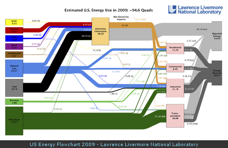
US energy flowchart
Today I saw an interesting chart:
This is a useful illustration because it clearly shows the main energy sources and users in the US, as well as separating the total energy used and wasted.
The original is from LLNL, I saw the link at Ars Technica.
