Gas prices and world car and bicycle production
[Update 2011-11-28] These statistics are a bit old, but I haven’t been able to locate good numbers that are more up to date. I’d greatly appreciate any pointers to more recent numbers.
(This is a re-post from last week. The original post disappeared in the server change.)
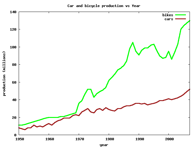
I saw a graph of car and bicycle production in The Economist. The article was On your bike: Obesity and high oil prices are good news for the world’s biggest bikemaker. This was one of the many recent stories on the increase in gas prices leading to more people riding bikes. The graph looks something like this:
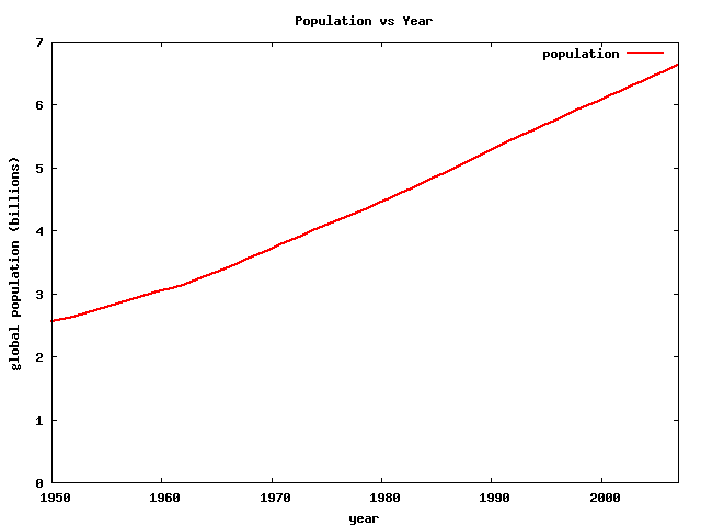
Car production is increasing as expected, but bike production is even higher. But does this plot tell us anything useful? Doesn’t world population growth look similar? I found that world population looks like this:
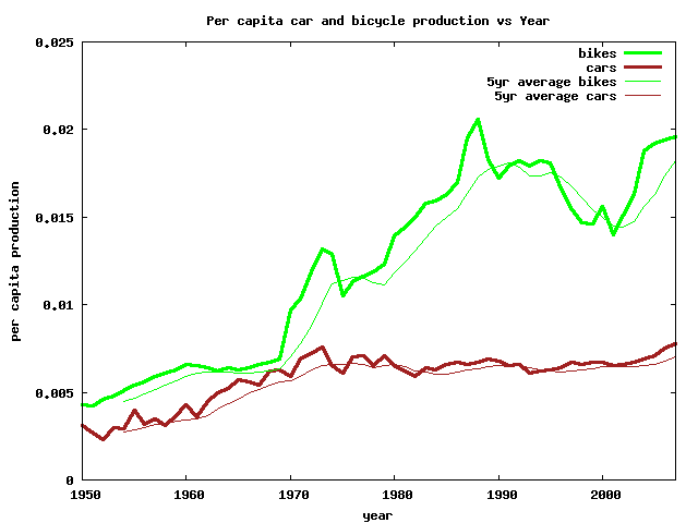
This is a huge increase. To make the bicycle production plot more useful, I can find the per capita production. Just divide the production by population:
This is a much more useful plot. Bicycle production is going up, but not as fast in the original graph. The current production is actually slightly lower per capita than in the late ’80s. The flatness of the car production line is surprising. I also added a five year moving average to the plot.
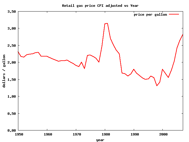
Since there are so many articles linking bicycling to gas prices, lets look at the price of gasoline. Because of inflation and other factors, the absolute price of gas isn’t very useful. I found the consumer price index adjusted gas price:
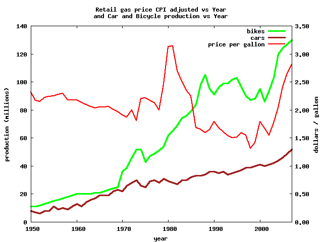
Hmm… that doesn’t look as bad as you would expect. This graph does make it really obvious that the data I am using stops in 2007. I can now add the gas price to the production plot. The production scale is on the left, the price scale is on the right:
Interesting. The gas price and bike production don’t match at all before the mid ’90s. The match for the past ten or so years is pretty good.
These are just some thoughts on getting useful information from graphs. I didn’t do any actual statistics, but this gives some ideas for how to make these plots more useful.
I highly recommend reading How to Lie with Statistics by Darrel Huff.
Sources:
- The Economist: On your bike: Obesity and high oil prices are good news for the world’s biggest bikemaker
- Earth Policy Institute: Economic Indicators: Bicycles
- U.S. Census Bureau: International Database
- U.S. DOE Energy Information Administration: Peal Petroleum Prices
